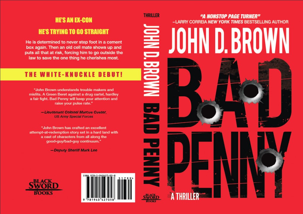
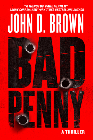
I know that many of you loved the Santa Muerte cover. But it was communicating the wrong thing. Alas. I love that tattoo. On another site I polled, everyone leaned towards the road and vanishing point. Then everyone I polled personally liked the initial concept for the one below. I liked the road, but the bullet holes won. Here is the final result.
Join My Newsletter!
Frank Shaw Series
The Drovers Series
Gun Runner
The Dark God Series
On Writing
Categories


