Readers, for the last year or so I’ve set the blog to show a summary of each post which you then click into as shown below.
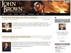
For the years before that I just showed the full text like you see now.
I personally engage more with full text displays because I read as I scroll, so even if I’m skipping, I do at least pick up the gist of the post.
Do you have a preference? Does one view “feel easier” to you?
Let me know.



Full text, please, sir.
Hybrid. Show a summary with the option to expand to see the rest of the post without taking you to a different page. That way you can continue scrolling once you read the post but don’t have to scroll through a long post you don’t want to read all of to get to the next one.
Replying to my own post because I can’t edit it. In full disclosure I subscribe to the RSS feed and don’t actually use the blog. I’m just making a suggestion based on what I’ve seen and personally prefer on other sites.
Thanks, Gray!
Thanks, Steven!
I’d like to get full text from your RSS feed… And thank you for writing such a great blog.
Thanks, J
I’ve always preferred full test.
Full text as well 😉
Thanks, Pete
Full text. I love reading your blog, but I do it in Feedly, which means I have to leave that app to view your full content. I’ll keep doing it, it is just a little inconvenient.
Full text wins 🙂
Summary
(oops…too late) 🙂