Shiny.
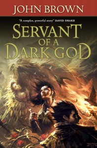
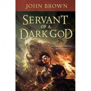
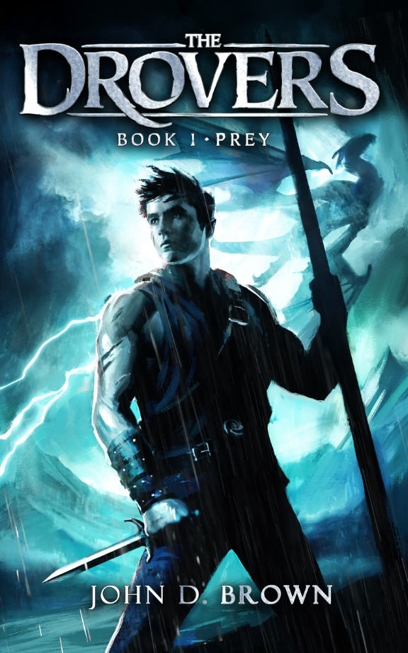
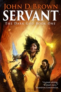
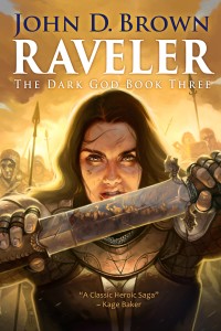
They moved the David Drake blurb to the side, lightened the lettering and moved things so the title wasn’t covering the top of Hunger’s head. At first I thought they moved the lettering, but they didn’t. It appears the shrunk Hunger a bit so we could see more of him. Small changes, but I think they make a significant effect. I think the overall effect is better. I like how Hunger looks more menacing in this one. Sugar is different. Don’t know which version of her I like better. I’m leaning to the original. Your thoughts? Either way, we luvs Tor’s art and production department. Here’s the before and after.






Thanks for the book sample! Really looking forward to it and I may come by my local book signing once I figure if there is any ‘real’ way to get an esignature for my ereader. Any word on whether it will be made available as an ebook?
Thanks–Jesslyn
Jesslyn,
Not sure. I’ll check into it and let you know. Glad to hear the sample worked for you.
This from my editor on the availability of an e-text version: “It ought to be made available at the same time that the book is available, if not very, very soon thereafter.”
Happiness.
My step daughter is graduating from Bountiful High School in 2012 and is running for class officer this year. She would like to suggest you as a possible speaker for her Baccalaureate “party”. She needs a phone number. I have looked everywhere . . . may we get one from you please?
I adore the book and love the way you write. I can’t wait for more.
Matthew,
Thanks a bunch for the encouragement. So glad to hear you enjoy it.