Devon Dorrity, who helped me put together my covers, just helped me put together some business cards. I’m pretty excited about them. I’m biased, but I think they look awesome.
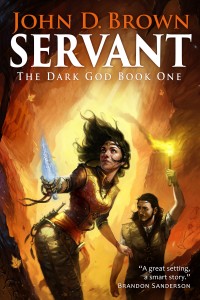
Servant
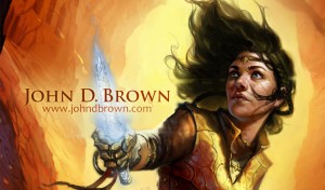
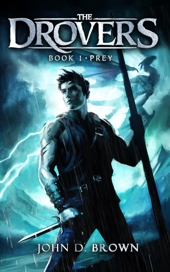
Curse

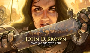
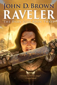
Raveler
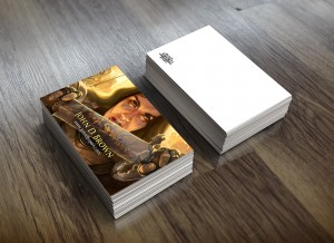
You can see here a mockup of how they’ll look. That bit on the back is the Blacksword Books logo.
I’m not sure about the one for Bad Penny. Devon liked it. Any opinions?
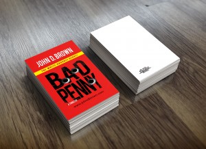


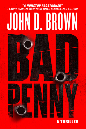
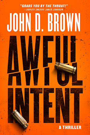



All look good. But on the ‘Bad Penny’ one, I would put your name in place of Bad Penny, and remove the name above. Right now looks too much like a book.
So, just a red background, your name in the Bad Penny font, plus the bullet holes, of course.
Thanks, Rick. That was actually the intent, so it’s good to know it’s working as intended. But I kind of like your idea too. We’ll have to mess around with it.
Odd thought, but either twist or perhaps slant the book cover, so it looks as if the book is sliding into or off the business card?
You mean on the Bad Penny one? That’s an interesting design to try