Back in July, I contacted the talented Victor Minguez again to do this cover. I sent him a creative brief with three scenes that I thought would work well. Victor read the passages, then came back with some sketches.
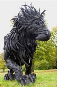
One of the scenes was of Sugar, battling howlers in the world of soul. Two parts of the reference I gave were the following. The first suggested an interesting lace pattern that fit my image of Sugar’s skenning. The second was a dead ringer for a howler. It’s actually “Lion,” made of used tires and steel by Yong Ho Ji. Okay I found it on Pinterest. But it’s absolutely gorgeous. I really thought this scene with Sugar would be the one.
Victor’s sketch is below. You can see the howlers in the foreground about to attack.

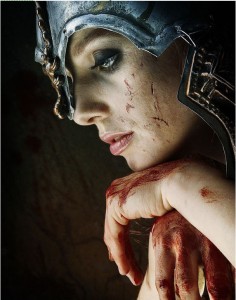
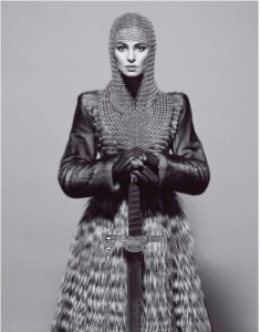
The second and third scenes were of Argoth facing down Mokad’s Guardian and Matiga and her fell-maidens in the final battle. The fell-maidens are women you don’t want to mess with. Some of the reference included these. BTW, if you’re interested in other images I’ve captured, feel free to browse my Pinterest collections.
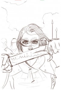
This is the sketch he came back with. His notes explained that the enemy line would be reflected in the sword.
I love the idea of Sugar and those howlers. I can see the image in my mind, and it’s awesome. But we felt this would make a more appealing cover. Maybe someday we’ll pay for someone to do that Sugar illustration just for the heck of it.
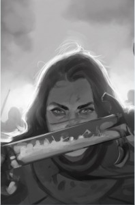
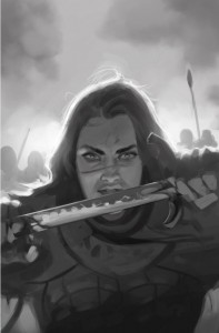
The next step was to do a value study. This was the first.

I wanted to see what a couple of variations might look like.
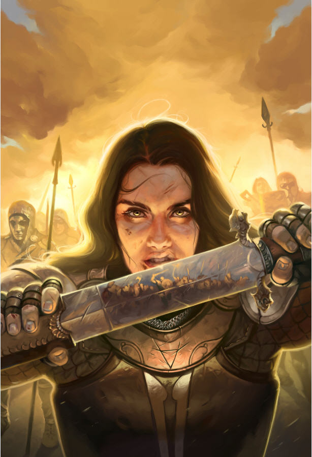
Ultimately, I thought all three of these were powerful. The first two really draw attention to her eyes and give a great focal point and hierarchy. In fact, I still go back and forth even now. But I did like seeing more of her face. I think anyone of them could have been great, but we ended up going with the third. A little magic from the artist, and Shazam!
There are a lot of things to love about this. Victor’s gorgeous backlighting and halo effects. The part of the story told in the reflection in the sword. And the fact that this woman is not some fluff bunny, running around in ridiculous bikini wear. She’s even got a bit of sneer or growl going on. My friends, this is a freaking fell-maiden. I also like that Victor etched an important symbol into the armor.
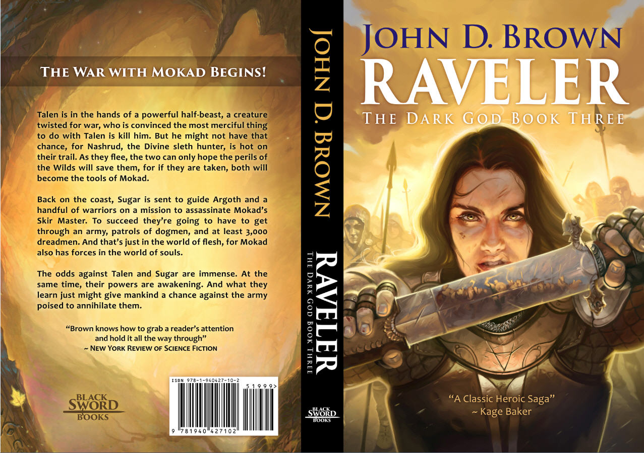
Here’s the illustration in the cover.








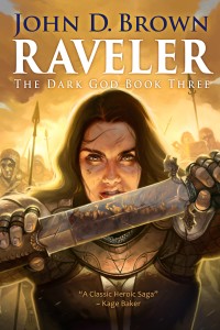
Brilliant! So fun to see the inspiration.