This is a story of how things went wrong and then went right. It’s also a cautionary tale for indie authors who want to direct their own art.
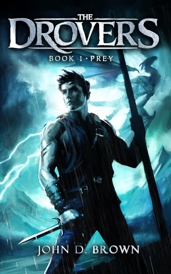
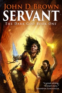
Victor Minguez did the art for Servant, which I think is awesome, so I naturally wanted him to do the art for the second book as well. I started as I have before by working up a detailed creative brief which stated my goals, suggested color scheme, identified the scene I thought we should illustrate, and provided plently of reference images. The goals for this illustration were that it had to say epic fantasy, fit with Servant, have energy, and pop in thumbnail.
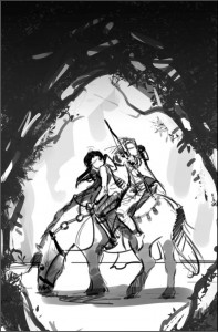
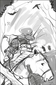
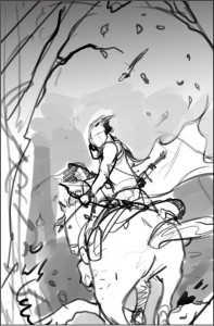
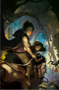
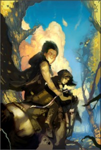
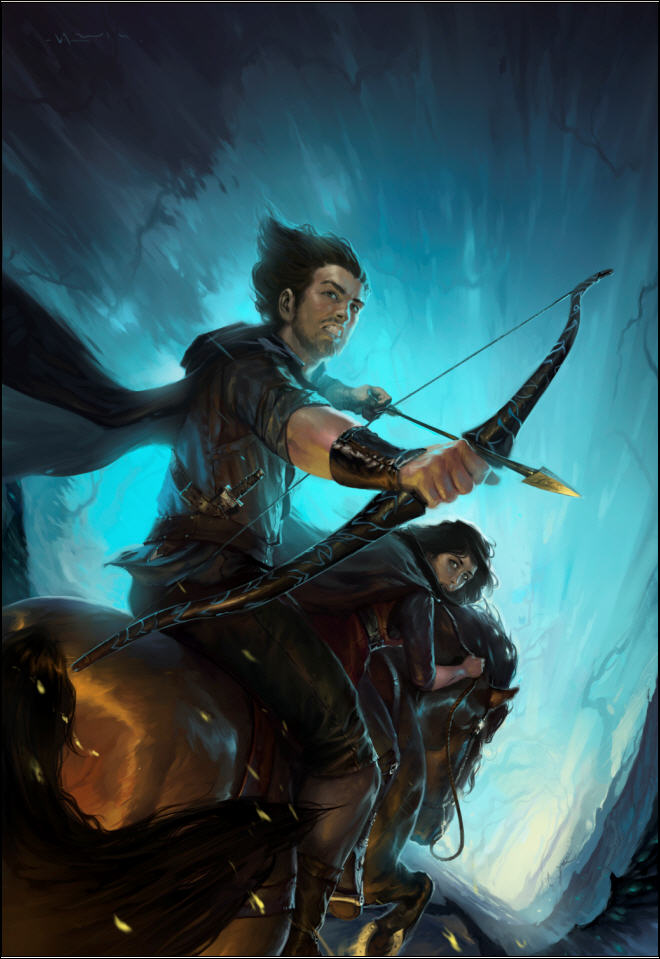
Victor came back with these sketches. I thought all of them were great concepts. The framed and rear view depict the moment before something dramatic is about to occur, as if something dangerous is out in the woods. The front view was well into a dynamic scene. I loved the contrast of the framed sketch, but was drawn most to the dynamic rear view. (Click on any image to see it full size.)
I knew from the last project that we needed to make sure that the illustration would integrate with the title and author’s name. And because we are going to brand the series, in part, by keeping the author name and title in the same position on all the books, I thought we needed to zoom in a bit. I tried various angles. Ultimately, we decided to flip it.
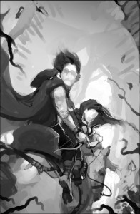
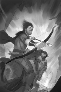
Victor then did another sketch with values to nail it all down. I thought this sketch was awesome. There was energy. It said epic to me. I was drawn immediately to the characters. I thought we had great contrast.
So the next step was to start laying in some colors.
And here is where the cautionary tale begins. I think I have a good eye. I know when something is working. But I’m not a trained artist. And I’m not a trained art director. Which means that while I have a feeling of where in general I might want something to go, I don’t know exactly what will get us there. And that means that sometimes I’m going to do a lot of, let’s try this, nope that isn’t it, let’s try this instead. Naw. Maybe this. And as I begin to ask the artist to tinker, the risk of me directing us into something that doesn’t work, and forcing the artist to work way over his or her budgeted hours increases dramatically. It also sometimes increases the risk of me losing sight of the end goal.
I keyed in on my desired color scheme. But a color scheme is a means to an end. I got trapped thinking about the means, not the end. So I asked Victor to get more gold and blue. Open it up.
Can you see me taking us away from the original concept? Not necessarily a bad thing. Art is often iterative. But I wasn’t done. I wanted color. At least, I thought I did.
Do you see where this is heading? But I had this idea and was determined to see it implemented . . .
Well, we got to this point. The artist was delivering what I’d asked. And it was shaping up to be a fine piece of art, but it was totally wrong for the book and genre. What’s more I was driving the artist nuts. For every change he’d make, I’d bring up two more. I was way too far into the details. I’d taken us way off course. And burned up all his hours doing it.
What do you do?
Luckily, I know someone who IS an experienced illustrator, who has worked on many different projects, and who was willing to step in as art director. Most importantly, with me out of the picture, the artist was willing to give it one more go with this new guy at the helm. I stepped completely away from the process. Here’s what happened in the words of the director (who wishes to remain anonymous).
ART DIRECTOR TO THE RESCUE
The goals for this image were to say fantasy and be eye grabbing at a very small size. I was brought on to accomplish those goals. I think we all felt that the image was too peaceful. It contradicted the feeling of danger we were going for.
Take two: John gave me the old thumbnails that Victor had. At first I looked to see what could be salvaged from the old completed painting to use in the new, but ultimately Victor came up with a more dynamic sketch, and we decided to go for it.
So we started there. The processes was an iterative one. Victor blocked it in, and we nailed down the values/black and white image. Values are the underpinnings of a painting; you want that to work on an abstract level first. Meaning if you didn’t know that it was a painting of Talen and River riding away on a horse, would the value patterns still be both striking and pleasing? There is no point in proceeding with a painting if either the drawing or the values are failing. After that came the color study.
Once nailed, we went to finish. Victor really put his heart into this and it turned out awesome! He’s got great talent, and is a pleasure to work with.
JOHN AGAIN
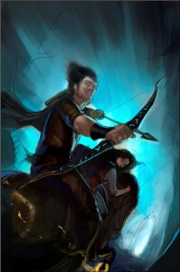
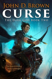
Are Minguez and Un-named Director good or what! It says epic fantasy. It says action. It has the level of darkness and energy we need. And it looks like it belongs with the cover of Servant. It’s going to work great, and I think the cover will pop in thumbnail, especially when we add the title (white, like Servant) and author’s name (probably a bright color taken from arrow head or horse shoe).
So lessons learned from this and the previous covers:
- Authors are not artists. Just because you know in general what you want doesn’t mean you have the ability to direct a project the way it should go. If you’re not careful, you will shipwreck the project.
- Having an experienced art director on board can do wonders.
- Keep the broad end in mind; try your best to let the artist focus on the means to that end. This doesn’t mean you don’t provide a lot of image reference up front, but you’re paying the artist for a reason.
- It’s helpful for the artist to estimate a total hours they’ll work for the project, even if you’re not paying them an hourly rate, and then keep you up-to-date on hours worked. This way you are forced to use their time wisely. You only have X hours to spend. Spend them on dumb changes, and you’re going to end up with something that’s half-baked.
And now a mystery.
I want you to look at the final image again. It’s not actually the final, final image. We had to ask the arist to make one more change because something was off. I will give you a hint. The change had to be made in the lower 1/4 of the image. Look at the image and see if you can find it. Do you see it?
In the next post about this art I’ll both reveal what needed to be changed and tell you something about this artist that I think you’ll find both inspiring and amazing.






Hurry up and post the next post – I’m dying to know! 😀
I like it!
I see a couple things that are odd in the bottom quarter:
1) The horse’s tail does not look like it is trailing in a strong wind — it kind of looks like it is flicking forward towards Talen’s calf, which does not seem likely if they are galloping.
2) The horseshoe is glowing, and it looks like it is gold-plated. A glowing gold-plated horseshoe???
Another thing that is odd, but not in the bottom quarter. Talen’s hair seems like it is blowing back from his face, but he is mostly turned backwards. I guess if there is something causing a really strong tailwind, that could account for the horse’s tail and Talen’s hair. Except it seems like the horse’s tail is getting blown to the right, and Talen’s hair is getting blown to the left. Hmmm.
One more thing. The way everything looks brightly lit from behind (horse’s rear, the horseshoe and arrowhead are really shining), I would think there should be a shadow of the horse clearly visible on the path ahead.
Awesome cover. Wow. I think I see the mistake though: Is Talen’s calf exposed and therefore supposed to be flesh-colored? Or is he wearing hose? Because it looks like the pants end at his knee.
Is that it?
And the horse — he’s just flicking his tail! (Plus, you really don’t want the tail to be streaming straight back, or else you’ll have something rather indecorous on your cover!)
All will soon be revealed 😀
Jared:
Have you ever seen a horse flick its tail while galloping? I have not, but I seriously doubt it looks like that. The muscles are just at the base of the tail. The rest is hair. If there is a strong wind from a gallop, then the tip of the tail would be pointing back, even if the horse did flick it.
So, how close is Curse now? I see the “final revision” bar graph is still at 0%.
John,
Good question. The target is still February. The reason why the final revision is still zero is that as I did the line edit and came to the end, I felt the climax sequence needed to be totally rewritten. It was good, but having had some time away, I could see a number of ways to make it better. And so the final edit (line edits) had to be put on hold so I could rewrite this sequence.
Once I finish this rewrite, then I go back to the final edit. Then we do a detailed copy edit of the manuscript. Then I transfer the manuscript into the proof (book) format and do one more detailed edit. Once that’s done, the book is done! So it’s all coming together, but I have to get this final sequence done.
Does that answer the question?
I think that answers the question. It sounds like it will come down to the wire to get it all done by Feb 28! 🙂
Don’t jinx me, man!
I did not jinx you! It is the Curse of the perpetually delayed book (perhaps it needs a new title?). I see it is March, now! 🙁
Curse: The Dark God Who Prevents Book Releases, Book 1
In which an author fights against beings of terrible power who have big issues with awesome entertainment . . .
(sigh)
For the last few weeks life happened at my day job. So the good news is that this delay is NOT like the previous delays with Tor. Life is now getting back to normal, which means we move forward.
I think when this book goes out I’m going to have to go to Disneyland or something. Raise a moument. Perform a sacrifice. Something.